
Everyone of us, I’m sure, is aware of what a logo is. A logo is your company/business name represented in an innovative way with the help of fonts or symbols.
Now, how important is it to have a creative logo?
Consider this. If you happen to meet with a person who has an impressive personality, you would definitely want to know him/her better. Similarly, a logo stands for the personality of a company. A badly designed logo would, in turn, reflect badly on the company.
The next question would be how does one go about designing a logo?
Many graphic designers don’t think beyond word-expression. A typical example of word expression would be using letters as a running man for a trouser brand named RUN. If RUN is a brand of trousers, it would make more sense in playing around with trousers! This is just an example. The point is that it’s absolutely essential to know the business of the company you are designing the logo for.
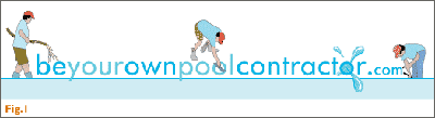
Fig.1 shows a logo we had designed for a company that built pools and helped one to get resources to build their own pools. The logo shows a person at different stages of building a pool. The point to mark is that we never used just a swimming pool. That would be the most common thing to do. Make pools out of the ‘O’s.
The best method to start designing a logo would be:
- to get into the core of the company – its history, its philosophy, its business model etc.
- to conceptualise in the simplest way possible to convey the business
- to visualise that concept into imagery
Enspear is a company that makes strategic use of IT to help your business reach new levels. Now after doing a lot of thinking, we came up with the idea of using the concept of a pole vault. One effortless jump and you win! Thus, the tagline “Pole Vault Your Business” was created. After that, the logo design was worked upon. The middle line of the alphabet E represents a flexible pole and the middle line of the N acting as the cross-over bar. Isn’t that simple?
Playing with alphabets in a logo should be done only if it suits the business of the specific company. Doing it just to be “creative” is not creative at all! Also, the font for the logos has to be picked carefully after a lot of thought.
Since the website dealt with digital technology, the font we chose for its logo looked digital too. And to give a feeling of a stream, we made the Xs look like waves. A perfect example of meaningful word expression.
Though we’ve had various opportunities to create logos, there have been times when clients have forced us to design logos according to their whims and fancies. One client wanted a photograph in his logo. We did try our best to convince him not to use a photograph but we didn’t succeed. What some clients don’t understand is the very purpose of the logo.
A logo has to be graphically and simplistically represented. By doing so, it becomes flexible enough to be reproduced in various media, for example, “letterheads, posters, hoardings, websites, leaflets, etc, in the smallest or the biggest size one wants.
Also, one has many printing options for a graphic logo, for example, offset, digital, or screen. Using a photograph would make your logo very difficult to reproduce through a printing process such as Screen printing. Considering that screen printing is still used worldwide for stationery printing, it’s absolutely a no-no to use photographs (unless you have to face a stubborn client!!)
The next topic to cover would be how to choose a colour scheme for your logo.
Simple. In Fig.1, the logo uses hues of blue since the company deals in building pools. Fig.2, the logo uses a solid black font to represent the strength on the company. The orange pole represents zeal and hope.
All colours existing in this world, bring out different emotions from within us. It becomes essential for us to choose colours that bring about a certain quality that the business stands for. When someone asks you what your logo means or what the colours represent, you should be able to answer the question without thinking. We put so much of our mind, effort and hard work into making one single logo, it might as well make a whole lot of sense and create a lasting impression on others.
Points to Remember when designing a logo:
- Think of an idea
- Make pencil scribbles on paper of what you have in mind. Do not get close to the computer before that!
- Choose the best scribbles and get on with it on the computer
- Think hard and select the fonts to be used for the logo
- Think hard again to select a colour scheme
- Try different colour and font options and choose your best out of them.
Points to remember when choosing a logo for your company:
- It should have an idea or subscribes to your company philosophy
- It should have a high recall value
- It should be able to stand the test of time. Example: Johnson & Johnson, Mercedes-Benz
- It should easily be adaptable across various media: Press, TV, Print, Web etc.